OWOT Today: Difference between revisions
| Line 800: | Line 800: | ||
'''Mr.Guy''' shares a few of his ideas on how to improve Our World of Text.<blockquote> | '''Mr.Guy''' shares a few of his ideas on how to improve Our World of Text.<blockquote> | ||
# ''Remove chat'' The chat, being one of only two immediately interactable UI objects on the page, sets the tone for the site. The content of the chat inevitably seems to become an expression of the current state of owot, an observation that can have a profound effect on the enthusiasm a person develops early on. Text on the canvas could be from any time in the past, put there by anyone for any reason. This directly opposes the effects of staring at the chat; in that it forces you to reckon the type of users and ideas you can expect yourself to be immediately surrounded by when you're on the site. You can't simply scroll those users or their messages away: the chat is a constant, consistent with the people that inhabit it. Where the canvas is a symbol of creativity not limited by boundaries, so to does the chat oppose this in interactive functionality and social design. As it stands now, the front page's chat has evolved from the intended "pin board" usage where users discuss a world, into a whole platform for real time communication. I believe this is where the abuse is stemming from, and I propose that removing the chat would be a good first step to dismantle the toxic attitudes that attract troll behavior to the front page. It would be wise to test it first; there could be other ways to integrate the chat (only visible/usable by registered users, whitelist, slowmode, etc) that might have more positive effects. | # ''<u>Remove chat:</u>'' The chat, being one of only two immediately interactable UI objects on the page, sets the tone for the site. The content of the chat inevitably seems to become an expression of the current state of owot, an observation that can have a profound effect on the enthusiasm a person develops early on. Text on the canvas could be from any time in the past, put there by anyone for any reason. This directly opposes the effects of staring at the chat; in that it forces you to reckon the type of users and ideas you can expect yourself to be immediately surrounded by when you're on the site. You can't simply scroll those users or their messages away: the chat is a constant, consistent with the people that inhabit it. Where the canvas is a symbol of creativity not limited by boundaries, so to does the chat oppose this in interactive functionality and social design. As it stands now, the front page's chat has evolved from the intended "pin board" usage where users discuss a world, into a whole platform for real time communication. I believe this is where the abuse is stemming from, and I propose that removing the chat would be a good first step to dismantle the toxic attitudes that attract troll behavior to the front page. It would be wise to test it first; there could be other ways to integrate the chat (only visible/usable by registered users, whitelist, slowmode, etc) that might have more positive effects. | ||
# ''Redesign the SOP'' This is the first monument seen by any new user who joins the front page for the first time. Very much about this experience is left vague, and almost no direction is given besides the ratings and teleportation station. Thus one ends up requiring much stronger curiosity and attention span than the average person generally exercises in order to discover the purpose of anything beyond the unprotected areas around spawn. I think that the SOP should be bigger with a few short tips so that users can glean fundamental concepts that embody the adventure of discovering the front page and expressing oneself on it, and there should most likely be a graphic content warning. Links to coordinates 50 out in any direction on the top and bottom and both sides of the SOP would give users immediate incentive to branch out. | # ''<u>Redesign the SOP:</u>'' This is the first monument seen by any new user who joins the front page for the first time. Very much about this experience is left vague, and almost no direction is given besides the ratings and teleportation station. Thus one ends up requiring much stronger curiosity and attention span than the average person generally exercises in order to discover the purpose of anything beyond the unprotected areas around spawn. I think that the SOP should be bigger with a few short tips so that users can glean fundamental concepts that embody the adventure of discovering the front page and expressing oneself on it, and there should most likely be a graphic content warning. Links to coordinates 50 out in any direction on the top and bottom and both sides of the SOP would give users immediate incentive to branch out. | ||
# ''Encourage registration'' Discouraging use of the site without an account will foster more users who feel like coming back and end up turning away low-effort attention seekers. This could be done by limiting features more harshly for unregistered users, including rate-limit, cell color, and ability to place links, while granting these features to any registered user. This would incentivize a more coherent community to form, and would aid in designing a more effective moderation system. | # ''<u>Encourage registration:</u>'' Discouraging use of the site without an account will foster more users who feel like coming back and end up turning away low-effort attention seekers. This could be done by limiting features more harshly for unregistered users, including rate-limit, cell color, and ability to place links, while granting these features to any registered user. This would incentivize a more coherent community to form, and would aid in designing a more effective moderation system. | ||
I'll continue this essay soon, I gotta go to work lmao</blockquote>'''.............''' | I'll continue this essay soon, I gotta go to work lmao</blockquote>'''.............''' | ||
Revision as of 13:42, 18 June 2025

OWOT Today is an OWOT news organization on Discord that posts daily news regarding the events of that day. It broadcasts in #general and is run by AndreiXYZ.
List of Posts
*Note: Yagton was Fern's username before she transitioned.
August 2023
| date | entries |
|---|---|
| August 24th, 2023 | OWOT Today's profile picture is complete! It is pretty much a parody of GD Today (as this whole account is) and features 12 users alongside the OWOT logo in the center.
List of users: InfraRaven, FP, anon_guy, Mr.Guy, poopman, theawesomepikachu20, happyworld392, DIGIBILLCIPHER, yagton, AndreiXYZ, KKosty4ka, e_g. The font used is Smidgen. |
| August 25th, 2023 | The center console has had a few minor updates, and flaws:
The candy emoji remains misaligned. ............. @> ✨ᗩI ⟨ 𝓐ndrei𝓧𝓨𝓩 🌌 ⟩ ◭⟁◮'s second contribution to the OWOT source code adds an option to block anonymous users from chat. (Run it with /block anon) https://github.com/system2k/NodeWorldOfText/commit/11f8dacabb33852290df89562cbb1aed80238098 |
| August 26th, 2023 | FP has set a temporary rate limit on the front page at spawn. |
| August 27th, 2023 | @FP has uploaded a preview video teasing at the ability to use CTRL+Scroll to zoom on OWOT without using your browser's zoom.
Basically, you won't have to always go into the menu and use the zoom slider, and furthermore, if you have a trackpad, you can hold CTRL and slide up and down as well. Another contribution by @this bread allows world owners to delete messages via the sender's chat ID and the message's creation timestamp (in Unix). @FP has added another option to the /block command where you can block registered users, for "completion purposes". ( |
| August 28th, 2023 | Our World of Text's latest changes have been deployed!Changelog Additions
Changes
|
| August 29th, 2023 | @Egg has surpassed @> ✨ᗩI ⟨ 𝓐ndrei𝓧𝓨𝓩 🌌 ⟩ ◭⟁◮ in message count. (67,422). |
September 2023
| date | entries |
|---|---|
| September 8th, 2023 | FP, Falling1 and e_g. have been attempting to fix a bug with inputs on Android. https://2s4.me/public/ + input*.html.
In addition, @Falling1 and @Egg have received the @Tester role for their efforts. ............. A few days ago, @FP has given @Egg, @theawesomepikachu20 and @Scɑr32 three unique worlds with invalid characters in the world names. They can only be visited through the /warp command.
............. @theawesomepikachu20 has gotten yet another WOTD. [/TimelineMachine](https://ourworldoftext.com/TimelineMachine) is the 116th WOTD, nominated on September 3rd, after a month of [/WOTDguessr](https://ourworldoftext.com/WOTDguessr) being the WOTD. It features the concept of travelling through different timelines of the front page. ............. Multiple members have managed to successfully grab Europe2048's account token by tricking him into sending the private part of his token in chat out of cluelessness, and grabbing his Uvias ID via a ............. FP's Discord account was just about to be ELIMINATED after ai_sponge's Discord server was PILLAGED ............. OWOT Today always strives to bring you the most important of news from OWOT. ............. The ............. The official Our World of Text Today Discord server has been opened to the public!, We have created this server as a means to let our followers know of future posts more easily and to allow your submissions to be more accessible, and furthermore, you will be able to have direct contact to our account managers, get announcements related to the account, and more! Hopefully this can be a good change for the account moving forward. Join now! '-> https://discord.gg/w8fP2d9qPU <-' |
| September 10th, 2023 | FP is planning to add the option to disable text copying and to enable the quick area deletion tool for world owners.
............. @Egg has reached 70,000 messages, being the first user to do so. ............. Dzeni has changed his profile picture on Discord to a cat. |
| September 14th, 2023 | FP has shared a preview of the new area deletion tool.
............. #owot has hit 200,000 messages. ............. @Egg's upcoming world, /impossibleway, has been delayed due to school, which sets its release timeframe to September-October. ............. The official world used for testing background colors, [/bcolor](https://owot.me/bcolor), has been griefed by an anonymous user with the message ............. The latest 2 posts have been submitted by @Egg! Remember to join our Discord server for notifications and to submit your news as well. Anything helps to make OWOT Today grow to become the most reliable OWOT news source created! https://discord.gg/w8fP2d9qPU |
| September 15th, 2023 | Our World of Text's latest changes have been deployed!,
changelog Additions
Changes
|
| September 17th, 2023 | @> ✨ᗩI ⟨ 𝓐ndrei𝓧𝓨𝓩 🌌 ⟩ ◭⟁◮ has been granted the @Scripter role for the following:
............. After being in the works for over a month, @Egg has released his latest world and upcoming WOTD, and his best work yet, [/impossibleway](https://owot.me/impossibleway). Currently, it features 100 tiles, and it will slowly be updated over time, the final update featuring a whopping 200 tiles in total. We see amazing potential with this world's concept and script, and we hope to see more from you in the future! ............. Our World of Text's latest change has been deployed!, changelog Changes
............. Modern Our World of Text's development has started 6 years ago! , https://github.com/system2k/NodeWorldOfText/commit/2abd81e2d900873391885364629819ff4e7a93ef 2191 days of OWOT and counting, this community has made really impressive worlds over the years, and we can't wait to see what you come up with next! |
| September 19th, 2023 | @why do i still have a nickname b's upcoming WOTD, [/impossibleway](https://ourworldoftext.com/impossibleway), has been placed on the poll.
............. @> ✨ᗩI ⟨ 𝓐ndrei𝓧𝓨𝓩 🌌 ⟩ ◭⟁◮ will be holding an interview with FP on October 1st, to celebrate OWOT's 6th anniversary. The interview contains 17 questions, the second part being "a little interesting". |
| September 25th, 2023 | @> ✨ᗩI ⟨ 𝓐ndrei𝓧𝓨𝓩 🌌 ⟩ ◭⟁◮ is the second person to reach 70,000 messages.
............. @> ✨ᗩI ⟨ 𝓐ndrei𝓧𝓨𝓩 🌌 ⟩ ◭⟁◮ will soon be hosting an event to celebrate OWOT's 6th anniversary where the community will decide the best WOTD via a bracket poll. |
| September 30th, 2023 | We would publish the latest OWOT news, but they'd get buried fast.
............. For the second time in its history, OWOT has suffered a proxy attack, heavily affecting the chat by using hundreds of websockets, making it nearly completely unusable. Our condolences to all of the families of the victims that have lost their lives during this incident, and we will make sure this never happens again. We shan't leave OWOT in danger, and we shall protect it no matter what. 9/29 #NeverForget ............. @realredtext's first contribution to the OWOT code came in handy for stopping yesterday's proxy attack, by adding a function for administrators to fully ban a list of IP addresses. The reason this was implemented is because bans used to apply on the HTTP side, but not on the websocket side. https://github.com/system2k/NodeWorldOfText/commit/32ac67927824d81a343fe023c6f42f59c9dba937 ............. InfraRaven shatters the world record for chat message length by sending a message with an astounding 504 CHARACTERS ............. @> ✨ᗩI ⟨ 𝓐ndrei𝓧𝓨𝓩 🌌 ⟩ ◭⟁◮'s interview with FP to celebrate OWOT's 6th anniversary is tomorrow. |
October 2023
OWOT Today was inactive for the majority of October and November.
Most of the following entries were retroactively posted after November 21st, 2023.
| date | entries |
|---|---|
| October 6th, 2023 | @> ✨ᗩI ⟨ 𝓐ndrei𝓧𝓨𝓩 🌌 ⟩ ◭⟁◮'s interview with FP has finished, containing 17 questions and 2 parts. The first part had questions only about OWOT, while the second part had questions inspired by Ryan Trahan's interview with Dr. Phil. You can read the interview's questions and answers for yourself here, and there'll even be an OWOT world featuring the interview soon!
............. As October came by, it was time for a new WOTD to flourish, but alas, due to numerous botting attacks performed on the poll, bringing our then-upcoming WOTD crafted by none other than @e_g. below 4 other competing worlds with the same like/dislike ratio, causing the WOTD to become inconclusive for a few days. ............. LOCAL OWOT ADMIN caught ENDORSING CHILD LABOR in modern day Read here -> #trash Mr.Guy For child labor "get a job punk" ............. @e_g.'s best world yet, [/impossibleway](https://owot.me/impossibleway), has rightfully been awarded the World of the Day rank for the massive effort poured into it. The OWOT Today team once again congratulates you for creating an entire platformer inside OWOT, and we cannot wait for you to unleash your fantastic potential once again in your future projects. ............. After multiple comments on trash's atrocious average message quality, #international has been rebranded to #off-topic, making it the official channel for off-topic conversations outside OWOT, leaving #trash as-is as an auxiliary channel mostly for unkempt conversations and shitposts. |
| October 7th, 2023 | @FP has removed the trademarks for unknown reasons from the OWOT logo, name and WOTD, leaving the Square of Publicity as the only trademarked item (possible oversight) on the center console. Once again, this has wreaked havoc and incited drama, which took the lives of several victims. Our condolences to all of the families who have had their members' lives lost. This needs to stop. Make OWOT great again!
............. Today, @e_g. has broken another message count barrier, this time being a whopping 80,000. This puts him at 27.7K messages behind the collective total discussion and spam of hundreds if not thousands of people over the span of 2 years (@Gateway#8555), and is expected to surpass it by Christmas Day, December 25th. |
| October 8th, 2023 | Our World of Text turned 6 years old today!
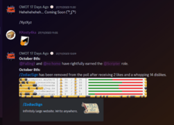
Six years ago, @FP has released his clone of Your World of Text to the public. To celebrate its 6th anniversary, the community has come together to make and paste various OWOT logo artwork around spawn, some even protected! To add, the trademark on the center console is back after FP noticed the amount of artworks still keeping it. @> ✨ᗩI ⟨ 𝓐ndrei𝓧𝓨𝓩 🌌 ⟩ ◭⟁◮ has also started a nickname party, which even had FP and Mr.Guy joining the train. Thank you for always supporting us throughout our journey. This news project would not have been possible without OWOT existing. We will forever keep this website in a special place in our hearts, and we will cherish all the memories together. @Falling1 and @realredtext have rightfully earned the @Scripter role. |
| October 10th, 2023 | For the first time in its history, OWOT has reached chat ID 1,000,000. |
| October 11th, 2023 | @poopman shares his newest groundbreaking script, which is a replica of MSPaint in OWOT, where you draw using octant blocks. https://github.com/poopman-owot/ms-paint |
| October 12th, 2023 | @> ✨ᗩI ⟨ 𝓐ndrei𝓧𝓨𝓩 🌌 ⟩ ◭⟁◮ has released his newest work yet, a world featuring an interview containing 17 questions directed to FP himself. https://owot.me/Interview_with_FP
............. FP is working on a new project codenamed Uvias Vector, intended to be a mix of Jotleaf and Discord's Jamspace. |
| October 13th, 2023 | The long chat ID chain has ended at around 4,655,000.
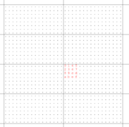
............. Here's a screenshot of FP testing an optimized spatial database using quadtree. |
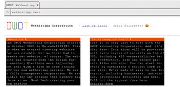
| October 15th, 2023 | @Polonez founds the [OWOT Webhosting Corporation](https://owot.me/webhosting) to help users of OWOT host their own sites as subworlds. |
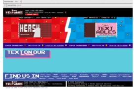
| October 16th, 2023 | FP uses Gen Z slang word to compliment @> ✨ᗩI ⟨ 𝓐ndrei𝓧𝓨𝓩 🌌 ⟩ ◭⟁◮'s [brand new chocolate brand](https://owot.me/webhosting/textables.owot) that will dethrone Hershey's |
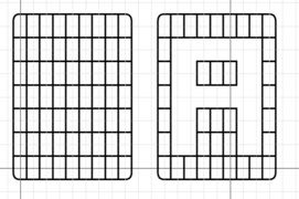
| October 19th, 2023 | History is made at 00:31 UTC for the longest time somebody hasn't noticed an error within a font template widely used by dozens, made by @e_g.
The sneaky q in the lighter red bottom part of the hole was found by FP. Edited screenshot on the right used for clarity. |
| October 20th, 2023 | The Restoration Union has discovered two extremely rare [ Server ] messages that are obscurely difficult to have them display the intended way.
|
| October 21st, 2023 | @fern gets asked by Oklahoma City resident to watch over his bag for 20 minutes while he goes to a nearby McDonald's. Once returned, he gave yagton a Quarter Pounder with Cheese as reward. Is this a Deserved W |
| October 22nd, 2023 | @poopman achieves Superuser rank, is willing to use it to monitor the chat more and to mute people multi-websocket spamming. ...Instead of completing his Superuser duties, 40 minutes after he has achieved this status, he uses his powers to send a r
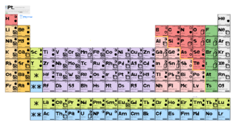
............. /jesusisking has been nominated as the 118th WOTD for only 20 hours due to lack of content and order, classifying it as a mini-WOTD. The WOTD has been replaced by the real 118th WOTD, [/webhosting](https://owot.me/webhosting) created by @s. Congratulations! ............. Long-time creator @theawesomepikachu20 has made a new world showcasing the mathematical puzzle and conjecture "Four fours", claiming that you can obtain any number up to a certain maximum, using only mathematical operations and symbols, and of course, four instances of the number 4, no more, no less. Check it out here -> /four_4s |
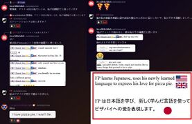
| October 23rd, 2023 | FP learns Japanese, uses his newly learned language to express his love for pizza pie.
FP は日本語を学び、新しく学んだ言語を使ってピザパイへの愛を表現します。 Yet again, OWOT has suffered another proxy attack. The attacker, suspected to be |
| October 24th, 2023 | @poopman updates his MSPaint script, adding opacity and freehand select. https://github.com/poopman-owot/ms-paint/blob/main/app.js |
| October 25th, 2023 | FP is willing to devise a security system to prevent anything like this ever happen again. |
| October 26th, 2023 | Since @e_g.'s world, [/saltdxmlog](https://owot.me/saltdxmlog), has been endorsing and documenting Dextromethorphan (DXM) and general drug usage and has had the lowest rating out of any other world on the poll, FP has royally removed it, including a countdown, along with 3 temporary celebration worlds on the poll, referencing Margaret Thatcher's death, /ding-dong, /the-witch, /is-dead.
............. @hijklmnop2 has created /three_3s, which is a spin-off of @theawesomepikachu20's world, /four_4s. The world aims to calculate every number using only mathematical symbols and three instances of the number 3. |
| October 27th, 2023 | Five Nights at Freddy's movie releases.
............. @s wipes /webhosting and other worlds in a fit of rage caused by @Deleted User's constant harassment towards him. FP was willing to make up for the loss of content by creating his own versions. ............. lime.owot has made a small world to celebrate Halloween. https://ourworldoftext.com/the_web ............. theawesomepikachu20 returns once again with another world documenting various OWOT user colors. This is actually a sequel to a world created around May 2023. https://ourworldoftext.com/usercolors2 |
| October 28th, 2023 | OWOT experiences a proxy attack for the 100th fucking time.
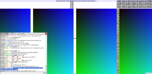
The server was attacked in retaliation for rate-limiting an individual for nuking the spawn using a script, FP believes the server went down for around 2 minutes at the most. Enormous portions of the far-east part of the main page are being engulfed by the gradient images, warranting a super-rollback once it's done. Can we fucking go ONE DAY without some motherfucker poking the servers with their nuclear bomb. |
| October 29th, 2023 | (https://ourworldoftext.com/grug2) new OWOT world, Guest-1052 big maker. FP choose WOTD in future, grug be happy. |
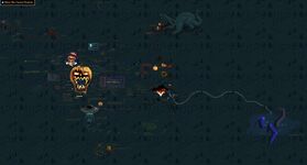
| October 30th, 2023 | To celebrate Halloween , FP and poopman have collaborated to make a Halloween-themed world, full with pumpkins and ghosts following your cursor and a cemetery background! [/Halloween23](https://ourworldoftext.com/Halloween23) officially lasted 2 days, from October 30th to November 1st, so here are a few screenshots of the stuff people have drawn! In addition, poopman has made his themed cursor script [open-source](https://github.com/poopman-owot/cursor-rep/blob/main/app.js ). yagton is working on adding a revolutionary module system enhancing the OWOT scripting lifestyle, where you will be able to import scripts in YOUR script straight from GitHub in just one line instead of pasting in everything from the script! ............. VC party is held in #General and #trash, lasting about an hour. |
| October 31st, 2023 | @SabrinaCarpenterFan has left her computer on for about 1.5 days straight to send 2 megabytes of pure OWOT chatlogs.
............. Some more progress pics on the module system.To address the backlash we have gotten from our manager's persistent procrastination, it felt fitting to rebrand our name to be correct again, as our news always are. ............. yagton finishes the module system, sends it off for approval on the OWOT GitHub page. https://github.com/system2k/NodeWorldOfText/pull/25 Modules are now staged on the [test server](https://test.ourworldoftext.com/). |
November 2023
| date | entries |
|---|---|
| November 1st, 2023 | yagton returns with another Pull Request, this time adding relative path support for module identifiers to ease making multi-file projects. https://github.com/system2k/NodeWorldOfText/pull/26
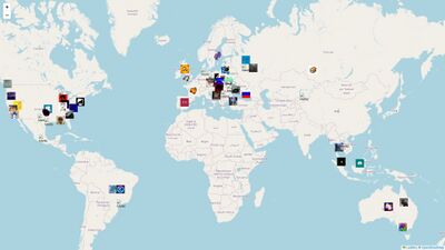
............. @> ✨ᗩI ⟨ 𝓐ndrei𝓧𝓨𝓩 🌌 ⟩ ◭⟁◮ remakes his year-old world map image of all active OWOT users and their countries as an interactive map hosted on https://owot-world-map.glitch.me/, featuring over 50 users. Click on the profile pictures to see their respective username if you don't recognize them!Being one of the oldest creators and users from modern OWOT, DIGIBILLCIPHER pays us a visit after 7 months of inactivity in the server, then streams Don't Starve for a short bit in the voice channel. Also, she has stated that she is actually a girl. (this surprised me too!) ............. @e_g. becomes the first person to hit 90,000 messages. |
| November 2nd, 2023 | #todo-document becomes public for around 7 minutes for the second year in a row.
............. Mr.Guy redesigns his main world. |
| November 3rd, 2023 | yagton comes back again with another Pull Request, this time fixing a bug with the . character in module user/repo identifiers. https://github.com/system2k/NodeWorldOfText/pull/27
............. @guest-1052 shares with us a plethora of interesting worlds he owns. https://ourworldoftext.com/InterestingWorldsIOwn |
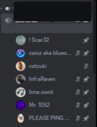
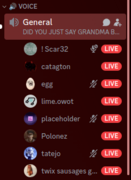
| November 4th, 2023 | FP makes a Geometry Dash reference with today's screenshot. The first large-scale #General party in a long time has been held starting at 14:27 UTC, and lasting 5 hours (ended at 19:29 UTC) featuring InfraRaven (with facecam!), FP, Scar32, KKosty4ka, Falling1, Guest-1052, realredtext, cygnus, yagton, Grey, Mr.Guy, UnicodeIXIXIXI, lime.owot, B, AndreiXYZ, e_g., Caioz, EEN, PCUser013 and more. At around 5 PM, they've also started various Discord Voice Activities. First mention: #scripting First VC message: #General End of party: #trash Below are a few screenshots from the VC party. |
| November 5th, 2023 | At 19:48 UTC, a soyjak.party raid took place in this server allowing around 20 raiders to post NSFW, extreme gore/NSFL, anti-LGBTQ, racism, unmoderated and unbanned for about 50 minutes before FP (while on his phone, not home at the time) was alerted about the ongoing raid and neutralized them, promising to delete all of the messages individually. No more than 10 minutes later, more raiders joined and continued the raid for 10 more minutes before FP came back and stopped them, issuing 12 bans, also setting an explicit image filter for non-role members. For investigational purposes, the invite codes used in the raid are of the following;
dU9w4cNW cfYYGS23 8p36VFwt |
| November 6th, 2023 | Caioz presents us with the center consoles he has crafted for [/main](https://owot.me/main). https://ourworldoftext.com/caioz./main_box/
............. It's InfraRaven's birthday, turning 33 this year. ............. theawesomepikachu20's world, [/four_4s](https://owot.me/four_4s), has been featured as the 120th World of the Day. Surely this world won't set off a world-trend consisting of tens of other fan-made worlds, right...? |
| November 7th, 2023 | [Spooks](https://spooks.me/) link reported missing, InfraRaven claims it's "just hiding behind the protection".
............. KKosty4ka shares a prototype of his new eraser script. ............. Guest-1052 showcases his own seed teleporter script, where you can enter any string and it will convert it to a random set of coordinates. https://ourworldoftext.com/seedteleporter |
| November 8th, 2023 | @s makes a pull request to OWOT's code, changing the regex for blocking to support display names. https://github.com/system2k/NodeWorldOfText/pull/28
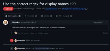
............. @kkostya makes a very similar pull request, but closes it after noticing UnicodeIXIXIXI has already made one. FP went on afterwards to make his own better commit. https://github.com/system2k/NodeWorldOfText/pull/29After showcasing his [collection of scripts](https://ourworldoftext.com/guest1052world#x:898,y:988), @guest-1052 earns the @Scripter role. ............. @lime.owot also follows shortly with the @Scripter role. .............
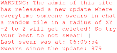
FP has released a teaser experimenting with a new design for the Chat button, in order to make it less attractive and tempting to click on. ............. The front page was attacked by a scripter who has made a script spamming red block characters over a random tile at spawn whenever a swear was said in chat, including a link that sends said swears. Some people used it to intentionally grief spawn. The attacker also claims that it was made by an admin, encouraging people not to swear. |
| November 9th, 2023 | yagton makes a wiki page for module documentation. https://wiki.ourworldoftext.com/wiki/Modules
yagton comes back with another pull request, fixing a couple of typos and improving local testing for modules. https://github.com/system2k/NodeWorldOfText/pull/30 Is FP's brain being consumed by Gen Z!!?? |
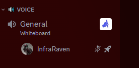
| November 10th, 2023 | The second large-scale voice chat party in #General has been held at 14:57 UTC, lasting 2 hours (ended at 17:07 UTC) featuring InfraRaven (with facecam, again!), cygnus, e_g., Guest-1052, FP, Falling1, B, poopman, draker, UnicodeIXIXIXI, KKosty4ka, yagton, AndreiXYZ, poiuytrew, asher and more.
At around 15:32 UTC, they've started playing Gartic Phone. InfraRaven has also showed his cat to the camera at around the same time. yagton has also boosted the server to Level 1, for the sole purpose of adding a cut-out of InfraRaven as an emoji First mention: #General End of party: #trash Below is an image of compiled screenshots from the VC party. yagton has also recorded the VC for around 1 hour and 15 minutes and is planning to release it soon! |
| November 11th, 2023 | Guest-1052 makes a couple of short worlds: [/owotcourt](https://owot.me/owotcourt) & [/juanperonscorpse](https://owot.me/juanperonscorpse) |
| November 12th, 2023 | FP reveals that there was a kill switch implemented for the OWOT gateway bot following a pinging disaster 2 years ago. It was useful for whenever he was away and the gateway was being abused to ping half the server repeatedly for a few hours. Nobody has actually known of it until now, and it was as simple as DMing the Gateway bot "self destruct". |
| November 13th, 2023 | @guest-1052's world, [/guest1052world](https://owot.me/guest1052world) has been featured as the 121st World of the Day. |
| November 16th, 2023 | The new chat button has been released to the public. The chat window's theme is just a user modification.
............. @guest-1052 has made a pull request, adding a chat command that clears the chat locally. This was closed shortly after due to FP making a better implementation, using |
| November 17th, 2023 | @fern almost died !!! Wanna find out? !!! Go round the campfire and I shall tell you all a story...
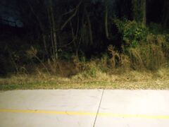
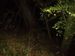
The day before, at around 9:01 PM (Oklahoma time), yagton started casually exploring a forested area after dark, hoping nothing out there could run up to him and attack him. The opening before going in the woods was by a walking trail that he's never gone on before. He has always had a passion for exploring locations that really don't need to be. Suddenly, he sees a deer casually run a good 50 meters in front of him, wondering to himself if this is a sign that he should turn back immediately. The deer started cautiously approaching him, but through a combination of shining his flashlight at it, whistling at it, and slowly backing up, yagton has successfully conveyed to the deer that he wants nothing to do with it. However, the deer was still slowly approaching, but it was obvious it was very cautious and was maintaining a distance, it was probably more scared of him than he was of it. Keep in mind that deer are generally pretty docile, unlike meese, which are attackers. Deer's main meal is grass and generally try to stay away from everything. After several minutes, the deer has satisfied its curiosity and has walked back to its mainland. Do you all think yagton could have lost his life if the deer had ran up to him at full speed.Our World of Text's latest changes have been deployed! Additions
Changes
............. @> ✨ᗩI ⟨ 𝓐ndrei𝓧𝓨𝓩 🌌 ⟩ ◭⟁◮ recreates the [Geometry Dash](https://owot.me/Geometry.Dash) title logo using background colors and octant block characters, all of this using just a Samsung tablet. |
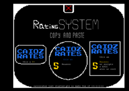
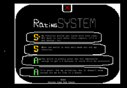
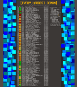
| November 18th, 2023 | @caioz makes a better version of his [old world](https://owot.me/Caioz-Rates) where he rates other worlds. Check it out here! [/CaiozRates](https://owot.me/CaiozRates) @lime.owot makes a pull request, making a custom function ( ............. @> ✨ᗩI ⟨ 𝓐ndrei𝓧𝓨𝓩 🌌 ⟩ ◭⟁◮ makes yet another fantastic mind-blowing world documenting Geometry Dash's history of the hardest Demons. This world will contain multiple lists documenting every top 1 including filters and scripts, and a comprehensive "time machine" of the top 10 hardest Demons from 2013 to 2023. This world may take several months to complete and may compete with other worlds for WOTD. Check it out here! [/Geometry.Dash/Demonlist_History](https://owot.me/Geometry.Dash/Demonlist_History) |
| November 17th, 2023 | A user named just.a.random.person has griefed the front page's spawn with fake art requests.
Due to attacks continued on other pages, [/guest-1052doesart](https://owot.me/guest-1052doesart) has gone private. Submitted by @∮* Mr. 1052@fern makes an unofficial Minecraft server run as an chaotic experiment where anything can happen at any time. Here are some details about the server: IP: officialmeowers.aternos.me:22086 Version: Java 1.12.2 Cracked player support: Yes ............. Here's more screenshots of the server. The second image shows a mountain that was drilled through with powerful explosions. ............. FP choose [/grug2](https://ourworldoftext.com/grug2), 122nd WOTD. Grug happy. |
| November 21st, 2023 | Hello everyone! We would like to take a moment to apologize immensely for our inactivity over nearly the past TWO MONTHS, but we just haven't had the time to submit more OWOT news here. We currently have a large backlog of unsubmitted articles, and we implore you to improve upon it and collect as much information as possible during these two months! https://discord.gg/w8fP2d9qPU 《 We want you to join this server, go over to #submissions and post ANYTHING you can, OWOT related, that has happened since October 8th, 2023 (excluding #OWOT6YEARS)!
............. Once again, we would like to strongly apologize for our huge break. We will be going back online shortly. Stay tuned! |
| November 22nd, 2023 | FP wishes everyone a happy Thanksgiving break at the top of the center console. (By the way, the protection on InfraRaven's PayPal link is gone, presumably to ease pasting further themed center consoles.)
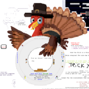
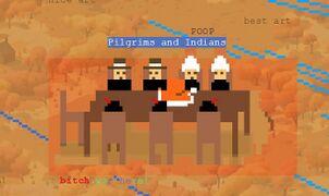
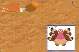
............. The center console has been updated to a plate held by a Thanksgiving turkey to celebrate the holiday. poopman and FP have also made [/Thanksgiving23](https://owot.me/Thanksgiving23), similar to the Halloween world. |
| November 24th, 2023 | @lime.cat updates his pull request by changing the emote height from 1em to 16px due to the em unit not being affected by browser zoom. https://github.com/system2k/NodeWorldOfText/pull/34/commits/92cc62d6f35d09c0766d7bd3acd4f2ff5d3d9bc4
|
| November 25th, 2023 | The OWOT Discord server has been raided by soyjak.party again, starting at 16:19 UTC and lasting about an hour before Mr.Guy and FP tackled them. Following this, FP has created a measure to prevent further raids like this involving shock images by whitelisting the ability to upload attachments and embed links, via the new @User role, which is granted manually.
............. In addition, @e_g. is the first person to receive said role. |
| November 26th, 2023 | @fern has made an alternative survival Minecraft server for those who do not like anarchy as much as the first server. normalmeowers.aternos.me:15850
............. Here's some progress on @> ✨ᗩI ⟨ 𝓐ndrei𝓧𝓨𝓩 🌌 ⟩ ◭⟁◮'s Demonlist History world. |
| November 27th, 2023 | theawesomepikachu20's world, [/usercolors2](https://ourworldoftext.com/usercolors2), has been featured as the 123rd World of the Day.
............ @> ✨ᗩI ⟨ 𝓐ndrei𝓧𝓨𝓩 🌌 ⟩ ◭⟁◮ starts catching up with @! OWOT Today ☑ news.Mr.Guy uses ChatGPT to make a fictional-horror world documenting a mysterious entity known as "[The Void](https://owot.me/void)". |
| November 30th, 2023 | @> ✨ᗩI ⟨ 𝓐ndrei𝓧𝓨𝓩 🌌 ⟩ ◭⟁◮ starts go[...]od [object] chain, FP gets involved. |
December 2023
| Date | Entries |
|---|---|
| December 1st, 2023 | FP mutes himself. |
| December 2nd, 2023 | After continuous annoyances from Kingdoms_gg (originating from soyjak.party) for well over a month, @> ✨ᗩI ⟨ 𝓐ndrei𝓧𝓨𝓩 🌌 ⟩ ◭⟁◮ has made a community poll asking people if FP should start being far more strict with Kingdoms.
At the end of the poll, 13 people voted against him (+1 alt), whilst only one "person" (Nonaem, which is nearly just as annoying) was in favor of his stay. People against Kingdoms include: AndreiXYZ, lime.owot, yagton, cygnus, Falling1, caioz, LiquidVicinity, realredtext, e_g., KKosty4ka, ntg, Guest-1052, Polonez (+ one of his alts). ............. @theawesomepikachu20 releases his latest upcoming WOTD, [/owot_card_game](https://ourworldoftext.com/owot_card_game), which the name may suggest, is based on character info-card games. The world was created after observing an anonymous user making a similar character card at spawn, and decided to build around the idea. A regular card contains a depiction of the user as a stickman, along with their name and the card ID. To the right of the stickman are the stats of the character, including Health Points (HP), Experience (XP), Attack (ATK), Defense (DEF), its weapon (with details), and a special ability. |
| December 3rd, 2023 | I swear bro why Yag's shit stickin up like cockatoo feathers @fern LMFAOOOOOOOAOAOOOOO. @∮* Mr. 1052 makes a world showcasing a funny script made by an anonymous user where you can drag any character on the canvas around. |
| December 4th, 2023 | Due to the abundance of university finals, FP is forced to take a break from development work until December 15th, which includes every project. Essential maintenance / work will still occur during this period! Due to this, Mr.Guy has been elected as the daily screenshotter for the next 11 days.
............. @∮* Mr. 1052 creates a small world featuring a snow-filled town called "[Snowland](https://ourworldoftext.com/snowland)". ............. hijklmnop2's world, [/three_3s](https://owot.me/three_3s), has been nominated as the 124th World of the Day. |
| December 5th, 2023 | @s makes another pull request, this time adding SVG icons for the admin panel. https://github.com/system2k/NodeWorldOfText/pull/35
............. FP is planning on repurposing the @Road Builder role to @Artist after multiple requests.The first of its kind, a feat that was believed to be impossible, @e_g. is officially the first person to reach 100,000 messages. This stupendous goal has taken him 1038 days, since February 1st, 2021, putting him at an average of ~96.3 messages per day. It's not over for message milestones for him, there is still one more mountain peak to be conquered, and that is surpassing @Gateway#8555's total message count of 108,421, across hundreds of people. 100,000th message: #trash Congratulations for this amazing feat! |
| December 6th, 2023 | How to deal with spammers 101, by Mr.Guy. |
| December 7th, 2023 | Let's wrap it up, ladies and gentlemen. FP meets the same fate as Viprin. |
| December 8th, 2023 | @kkostya shares a 3 hour timelapse of OWOT's spawn. |
| December 9th, 2023 | The truth has been revealed... @∮* Mr. 1052 creates an unofficial Discord server for [/main](https://owot.me/main). https://discord.gg/NtmedumjT2 ............. FP finally bans Kingdoms.gg after a month of him harming this server. ............. @> ✨ᗩI ⟨ 𝓐ndrei𝓧𝓨𝓩 🌌 ⟩ ◭⟁◮ designs a new center console for [/main](https://owot.me/main) based off meimei's SLC art for Christmas 2022. |
| December 10th, 2023 | The OWOT Discord server sets a new record for most streams at once, at 8. |
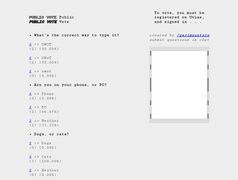
| December 12th, 2023 | @! ! ass uses comu links to make interactive polls on [/public-vote](https://ourworldoftext.com/public-vote). "This reminds me of [Let's Settle This](https://neal.fun/lets-settle-this)" —AndreiXYZ |
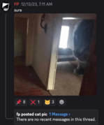
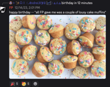
| December 13th, 2023 | FP has muffins for breakfast again, claims to be able to send a 97.5 exabyte CSV file containing the individual positions of the atoms in one of his muffins. ACCOUNT BAN WAVE Guest-1052's account gets disabled for being underage, and Sabrina's account gets limited for doxxing someone she hated. SEEK SHELTER IMMEDIATELY (or don't, you know who you are ) ............. FP posts a cat image. |
| December 14th, 2023 | @! ! ass creates [/mariana](https://owot.me/mariana), which contains 5 levels and is an unofficial sequel to yagton's world, [/cryptic](https://owot.me/cryptic).
............. @kkostya shares some interesting stats from his crawler, including the most viewed worlds, the oldest worlds and the oldest chat messages. |
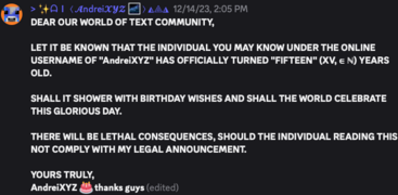
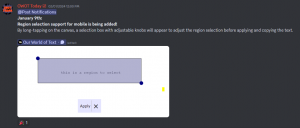
| December 15th, 2023 | @> ✨ᗩI ⟨ 𝓐ndrei𝓧𝓨𝓩 🌌 ⟩ ◭⟁◮ celebrates his birthday, turning 15 years old. FP joins in with twenty-five lousy cake muffins to celebrate and cherish this holy day. FP shares his Bytebeat melodies. #owot https://2s4.me/public/bytebox/main.html https://dollchan.net/bytebeat/ ............. Mr.Guy shares a few of his ideas on how to improve Our World of Text.............. yagton makes a pull request adding support for Docker. https://github.com/system2k/NodeWorldOfText/pull/36 ............. FP's development freeze period has ended, his next immediate task for OWOT being implementing a long-press menu to select a region, copy a character, etc. so that poopman's mobile-friendly script won't be necessary. |
January 2024
February 2024
March 2024
April 2024
2025
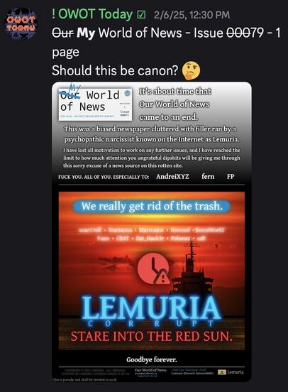
On February 6th, 2025, OWOT Today was briefly brought out of retirement to commemorate the death of Lemuria's newspaper Our World of News. This second newspaper had been mired in controversy for most of its lifespan as a result of biased content and heavy filler.
