OWOT alignment charts: Difference between revisions
| Line 128: | Line 128: | ||
As it turned out, chaotic users were more "evil" on average than "good" users. | As it turned out, chaotic users were more "evil" on average than "good" users. | ||
Users were then labeled according to the following color scheme. | |||
# blue=lawful, green=good,red=bad | # blue=lawful, green=good,red=bad | ||
# yellow=both good & bad characteristics | # yellow=both good & bad characteristics | ||
# cyan=lawful good | |||
# magenta=lawful evil | # magenta=lawful evil | ||
# red=chaotic evil | # red=chaotic evil | ||
Lawful good(cyan) users are clustered near the top of the chart, while magenta and red are more spread out. | |||
After some thinking, ChromicQuanta decided that the data would be better suited for an OWOT user tier list, which they are currently making.<gallery mode="packed" heights=" | After some thinking, ChromicQuanta decided that the data would be better suited for an OWOT user tier list, which they are currently making.<gallery mode="packed" heights="540"> | ||
File:Chromic quanta owot alignment chart 1.png|An early version of the chart. Rather than averaging the data | File:Chromic quanta owot alignment chart 1.png|An early version of the chart. Rather than averaging the data from every response, each submission is placed separately to get a better sense of differing opinions on certain users. For instance, we can see that most opinions on Lime place him firmly in the lawful good cluster, while opinions on d9 is significantly more spread out. | ||
</gallery> | </gallery> | ||
Revision as of 13:59, 9 June 2025
*See more miscellaneous OWOT media at OWOT Fanart
A compilations of alignment charts created by OWOT users in order to judge other members of the community.
Alignment charts became a big fad in June of 2025, after Rscr posted one into the OWOT Discord and multiple other users followed.
But charts of a similar purpose had been compiled as early as ~2022, by users such as AndreiXYZ and the members of /OWOTD.
Rscr
Rscr created an OWOT alignment chart on June 6th, 2025, which set off the whole trend. He had previously created two other charts, though they were significantly sparser in information due to Rscr's inexperience with the community.
Though the graphs were largely composed based on vibes, Rscr later compiled a rough set of rules for assigning user positions.
It goes as follows:
- "Lawful" indicates users with an at least semi-defined code of conduct, and who gives detailed, sincere justifications for their opinions.
- Ex. The Manhatingzone has an """"ethical"""" code centered around misandry, making original content and [less savory material]. They also exposit entire walls of text justifying their opinions of other users.
- Andrei is known for expressing strong opinions against misbehaving users in drama; in other words he has a well defined sense of right and wrong within the context of the community.
- "Chaotic" indicates users who act mostly on impulse, to get a reaction out of people or "just for the funny." This is mostly for people who have not expressed any strong/sincere opinions during Rscr's time within the community.
- "Neutral" is more vaguely defined, but usually contains more passive traits. Whereas a lawful person would want to assert their opinions, and a chaotic person would want to make things more interesting through humor and/or trolling, a neutral person lacks either of those desires and simply wants to get along with their fellow users.
- Ex. Someone like Jamel who just wants to be left alone would be considered neutral.
- They can still be "evil," however, if they exhibit toxic behavior in addition to their passivity.
- Good and Evil are mostly based on whether a user is a respectful figure within the community, or is genuinely malicious.
- Harmful actions like spamming and griefing would only make a user more chaotic, but toxic behavior such as harassment makes them more "evil."
- A "good" user is someone who has benevolent interests in mind, whether towards the community or to any other users.
*Note: This standard was only composed after the completion of Rscr's graph, so there are many discrepancies between the two.
On Rscr's graph, most users are neutral good.
-
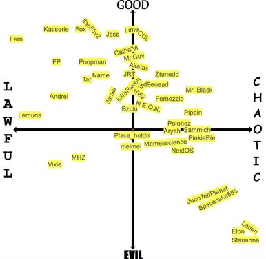 New alignment chart from June 6th, 2025, after Rscr had learned more about the OWOT community
 -
 Old alignment chart from September 21st, 2024, after Rscr had just joined the OWOT community
 -
 November 23rd, 2024


d9eoead
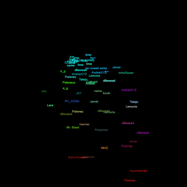
D9eoead worked on a larger alignment chart from June 6th to June 7th, 2025.
Having been on the site since 2018, d9's chart contains much more users. Alt accounts are included as well, including ThatSillyGuyOWO(Polonez's alt) and Iotawop(d9's former username).
Users deemed "Saints" by d9 include lime.owot, a generally well respected figure within the community; Fern, who is a competent and trustworthy admin of the OWOT Discord; and PC_KOSA, a user known for enforcing the site's rules. In particular, PC had previously dug through chatlogs to unearth incriminating information on both Lemuria and d9 himself. He also claimed responsibility for reporting Polonez's Discord account after his relationship with Lime was revealed. Though d9 attested to PC's strict adherence to rules, Rscr questioned whether he should be placed so far up on the "good" spectrum. Because of this PC_KOSA's position was slightly lowered in the final version of the chart.
Other than the Saints, the upper left quadrant is divided into LG(lawful good)—which includes Tap20, a user who d9 had cited as the beating heart of OWOT—and NG(neutral good). In the center is TN(true neutral)—featuring mostly inactive users like Poopman—while the upper right quadrant is occupied by "Jesters"(chaotic good), among whom are many comedic users like Ztunedd and Akatas. The chaotic neutral cluster contains the most users by far and includes most of the OWOT Discord's active members. Slightly further down are Fiends and CE(chaotic evil), which include many of the site's more annoying trolls(Ex. NextOS, OrasOWOT). But the most reviled of all is HCE(hyper chaotic evil) with members like Starianna, Huurmoonec and Scientist, whose crimes will not be stated here.
There is also a neutral evil category called Satyrs, which is composed of "laid-back trolls" who are toxic but "not SUPER evil, and also has ethics and patterns." Notorious users like PinkiePie, Scar32 and Laden are listed here, all of whom are somewhat well-respected despite their track records. Last of all there is a lawful evil category consisting of Lemuria, Vixie and the MHZ. Lemuria jokingly pointed out that he had an entire section named after himself, with LE standing for "LEMURIA."
Notably, neither d9eoead nor his former persona Iotawop are included in any of the defined categories. Other outliers include realredtext and Meimei, two users with mixed reputations within the community.
And though they (understandably) cannot be placed on the chart, d9 has stated that most anons fall into the lower quadrants.
This graph set the precedent for future alignment charts to have separate placements for Fern(as an admin) and Fern(as a regular user), with admin Fern being far more lawful than regular Fern.
*It should also be noted that the chart is still being worked on, with different users shifting places and more users being added.


Name
Name created his alignment chart on June 7th, 2025 using MSPaint.
The inner lines are purposefully askew for comedic purposes.

lime.person
On June 7th, 2025, Lime compiled his own chart in Desmos.
Though unlabeled, the axes are the same as in previous charts, with up being good, down being evil, left being lawful and right being chaotic.
Certain users are displayed as lines rather than points in order to represent them having a range of behavior.
All "good" users have a Y value of exactly 0.9.
-
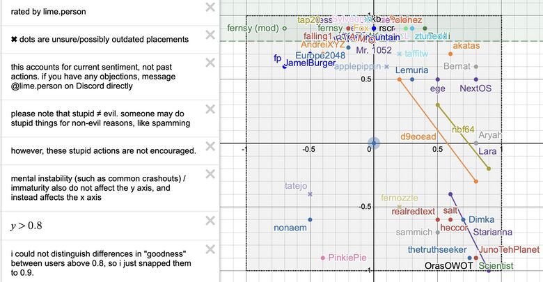 Entire chart + notes
 -
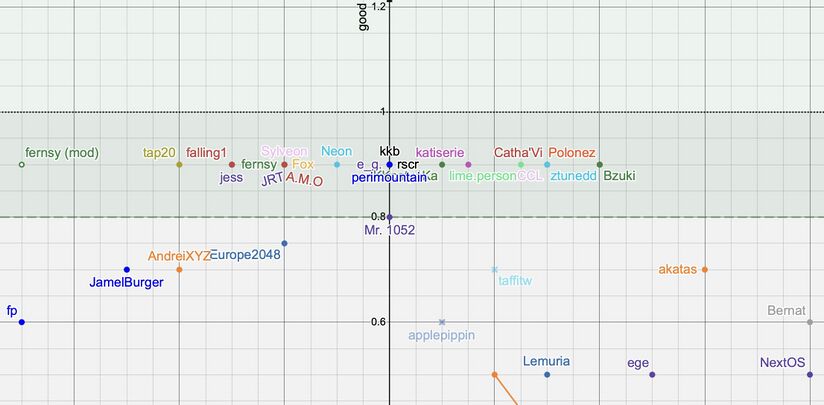 Zoomed in version of the "good" section


ChromicQuanta's OWOT Alignment Survey

On June 8th, 2025, ChromicQuanta created a survey for participants to access their opinions on other users, with the purpose of compiling the data into an alignment chart.
The survey begins with two free response questions:
- What is your OWOT username (case sensitive)?*
- What is the OWOT username of the user you're discussing here? (May be anyone you want except yourself)*
All other questions have you select a number from 0 to 5, where 0 is "strongly disagree" and 5 is "strongly agree."
- You find the user pleasant to interact with
- The user has good repute among the OWOT community
- The user frequently engages in aimless & destructive acts (spamming, hacking, insulting others, etc) within the OWOT community
- The user carefully avoids breaking rules & annoying the community
- The user is kind to those who are friendly to them
- The user often lies to get out of trouble
- The user shows interest in, or actively participates in positive aspects of the OWOT community (moderating, art, useful scripts, OWON, etc)
- The user is frequently interacts with the greater OWOT community
- The user is online frequently, but focuses more on communities outside of OWOT
- The user has a general disregard for rules
- The user is highly egotistical
- The user is bigoted (racist, misogynistic, transphobic, etc)
- OWOT would be better off without the user within the community
- The user fails to keep up with responsibilities they asked for on OWOT (lazy moderating, not completing a script they started & announced to others with a promise of releasing it, etc)
- The user is generally paranoid of authority
- The user trusts others within the community
Results
See the results of the survey here.
As of June 9th, the survey had received 58 responses from 14 users. Of them, Rscr and Sylveon were the most active at 23 and 13 responses respectively. Both of them claimed to have submitted a form for every user that was relevant to them(though Sylveon had excluded people they might have a bias towards). Other prevalent voters were name_official at 5 votes, lime.owot at 3 votes, along with Catha'vi, ntg, Polonez and Fox, who each submitted 2 votes.
The most commonly discussed users in the survey were d9eoead and Lime at 6 votes each. This made sense, as both users were involved in drama at the time of the survey over Lime's relationship with former troll Polonez, who was also a prevalent subject of discussion at 5 votes. Other notable users were AndreiXYZ, Crazy Cat Lady, Catha'vi, FP, Jamel and Lemuria, who all received 3 votes on account of their varying degrees of reputation within the community.
29 users were discussed in total.
*It should be noted that a few submissions included different spellings for both the name of the user submitting and of the user discussed, causing them to be split into separate categories in the results.
(Ex. One submission named Polonez as "Polonezz," and others yet provided satirical alterations to usernames, such as "OWOT'S #1 PARASITIC TUMOR: POLONEZ." Similarly, Lime's submissions were split into three categories under "lime.owot," "lime.OwOt" and "lime.person.")


Charts
The data collected from the survey were not organized under any predetermined metrics. Rather, ChromicQuanta had wanted to sort users loosely and see what patterns popped up.
As it turned out, chaotic users were more "evil" on average than "good" users.
Users were then labeled according to the following color scheme.
- blue=lawful, green=good,red=bad
- yellow=both good & bad characteristics
- cyan=lawful good
- magenta=lawful evil
- red=chaotic evil
Lawful good(cyan) users are clustered near the top of the chart, while magenta and red are more spread out.
After some thinking, ChromicQuanta decided that the data would be better suited for an OWOT user tier list, which they are currently making.
-
 An early version of the chart. Rather than averaging the data from every response, each submission is placed separately to get a better sense of differing opinions on certain users. For instance, we can see that most opinions on Lime place him firmly in the lawful good cluster, while opinions on d9 is significantly more spread out.

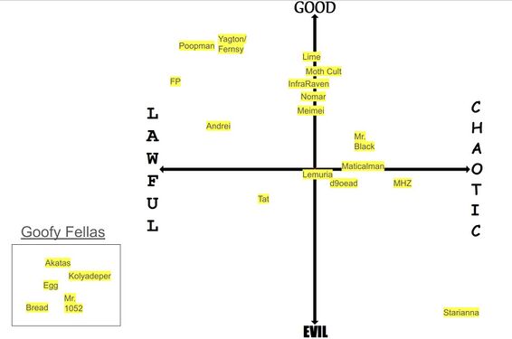
Bzuki
Bzuki made this chart on September 22nd, 2024 in response to Rscr's first alignment chart.
The graph contains many older users that newcomers wouldn't recognize.
It is also based on how any given user has treated Bzuki in the past, making it rather biased.

Lemuria's Goodness/Agreeability Chart
Lemuria created this graph on September 23rd, 2024 in response to Rscr's first alignment chart.
The graph is entirely centered around whether any given user agrees with Lemuria, and whether he likes them or not.
Several users, most notably Andrei, have criticized this alignment chart for being narcissistic.


/OWOTD Alignment Charts
Created in /OWOTD by members of the Manhatingzone. These were from a much older era than the other graphs on this page, and contain information about a slightly different group of users than those active in the present day.
It should be noted that /OWOTD has historically been a propaganda channel for the MHZ.


e_g.
Created by e_g. on June 10th, 2023.

AndreiXYZ

Created by AndreiXYZ in response to e_g.'s chart.
